


According to a matched set of circumstances regarding the user's device, browser, or system settings, media queries can alter the design (and possibly activity) of a website or app.
CSS Media queries are a method of targeting browsers based on certain traits, features, and user preferences, and then applying styles or running other code depending on those factors. The most prevalent media queries in the world are those that target certain viewport ranges and apply custom styles, which gave rise to the term responsive design.
/* When the browser is at least 700px and above */
@media screen and (min-width: 700px) {
  .element {
    /* Apply some styles */
  }
}
Aside from viewport width, there are numerous other things we might aim for. That may be screen resolution, device orientation, operating system preference, or anything else from a long list of variables that we can query and utilize to lay out information.
Utilizing media inquiries
HTML
There is the link> element, which is placed directly in the document's head>. In this case, we're instructing the browser to use different stylesheets at various breakpoints of different sizes:
<html>
  <head>
    <!-- Served to all users -->
    <link rel="stylesheet" href="all.css" media="all" />
    <!-- Served to screens that are at least 20em wide -->
    <link rel="stylesheet" href="small.css" media="(min-width: 20em)" />
    <!-- Served to screens that are at least 64em wide -->
    <link rel="stylesheet" href="medium.css" media="(min-width: 64em)" />
    <!-- Served to screens that are at least 90em wide -->
    <link rel="stylesheet" href="large.css" media="(min-width: 90em)" />
    <!-- Served to screens that are at least 120em wide -->
    <link rel="stylesheet" href="extra-large.css" media="(min-width: 120em)" />
    <!-- Served to print media, like printers -->
    <link rel="stylesheet" href="print.css" media="print" />
    <meta name="viewport" content="width=device-width, user-scalable=false;">
    <title>Developer-zone Pk</title>
  </head>
<body>
</body>
</html>
Why would you want to do something like that? It can be a good approach to fine-tune your site's performance by dividing styles apart so that they are downloaded and provided by the devices that require them.
To be clear, this does not always prohibit stylesheets that do not meet certain media queries from downloading; rather, it assigns them a low loading priority level.
As a result, when a tiny screen device, such as a phone, views the site, it will only download the stylesheets in the media queries that correspond to its viewport size. However, if a bigger desktop screen becomes available, it will download the full collection because it matches all of those searches (well, minus the print query in this specific example).
That is only the link> element. As shown in our guide to responsive images, we can use media queries on the source> element to tell the picture> element which version of an image the browser should use from a list of image alternatives.
<picture>
  <!-- Use this image if the screen is at least 800px wide -->
  <source srcset="cat-landscape.png" media="(min-width: 800px)">
  <!-- Use this image if the screen is at least 700px wide -->
  <source srcset="cat-cropped.png" media="(min-width: 700px)">

  <!-- Use this image if nothing matches -->
  <img src="cup.png" class="cup" alt="A basic measuring cup made of plastic">
</picture>
Furthermore, this can be a great performance advantage since we can deliver smaller pictures to smaller devices, which are presumably (but not necessarily) low-powered devices wCSSith restricted data plans.
Not to mention that we may utilize media queries directly on the style> element:
<style>
  p {
    background-color: #0A66C2;
    color: #E2F0FE;
  }
</style>

<style media="all and (max-width: 500px)">
  p {
    background-color: #121212;
    color: blue;
  }
</style>
CSS
Once more, the most frequent location to see a media query in the wild is in CSS. They are placed directly in the CSS in a @media rule that encapsulates elements with conditions for when and where a set of styles should be deployed when a browser matches those conditions.
/* Viewports between 320px and 480px wide */
@media only screen and (min-device-width: 320px) and (max-device-width: 480px) {
  .cup {
    background: #0A66C2;
  }
}
So it is workable to scope imported CSS rules, however, avoid using @import as a general rule so it performs badly.
/* Avoid using @import if possible! */

/* Base styles for all screens */
@import url("style.css") screen;
/* Styles for screens in a portrait (narrow) orientation */
@import url('landscape.css') screen and (orientation: portrait);
/* Print styles */
@import url("print.css") print;
A Media Query's Anatomy
So that we've seen a few instances of how media queries might be utilized, let's dissect them and figure out what they're doing.
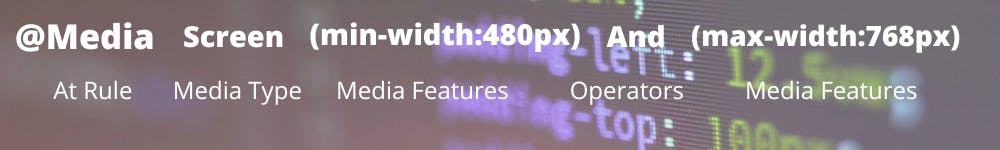
@media
@media [media-type] ([media-feature]) {
  /* Styles! */
}
The @media rule, which is one of several CSS at-rules, is the initial component in a media query formulation. Why is @media getting so much attention? Because it is tailored to the kind of media used to view a site, the features supported by that media type, and the operators that may be applied to mix and match basic and complicated circumstances alike.
Media types
@media screen {
  /* Styles! */
}
What kind of media are we attempting to reach? In many (if not most) situations, a screen value will be used here, which makes sense given that many of the media types we're attempting to match have screens linked to them.Of course, screens aren't the only sort of media we can target. We have several, including:
- all: Matches all devices
- print: Matches documents that are viewed in a print preview or any media that break the content up into pages intended to print.
- screen: Matches devices with a screen
- speech: Matches devices that read the content audibly, such as a screen reader.
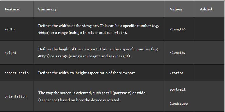
Media features
We can start describing the features we're seeking to match once we've defined the type of material we're trying to match. We've looked at a lot of instances where screens are matched to width, where the screen is the type and both min-width and max-width are featured with particular values.
Viewport/Page Characteristics
Operators
Media queries, like several programming languages, enable logical operators, allowing us to match media types based on particular requirements. The @media rule is a logical operator that simply says "if" the following kinds and features match, then do something. and But we can use the and operator if we want to target screens within a range of widths:
/* Matches screen between 320px AND 768px */
@media screen (min-width: 320px) and (max-width: 768px) {
  .element {
    /* Styles! */
  }
}
or (or comma-separated)
We can also use commas to separate features when applying an or operator to match various ones:
/*
  Matches screens where either the user prefers dark mode or the screen is at least 1200px wide */
@media screen (prefers-color-scheme: dark), (min-width 1200px) {
  .element {
    /* Styles! */
  }
}
not
Then we should target devices based on what they don't support or match. So when a device is a printer and can only display one color, this expression eliminates the backdrop color from the body.
@media print and ( not(color) ) {
  body {
    background-color: none;
  }
}
Please just leave any additional tips as well as tricks in the comments. Thanks a lot:)
Get in touch with me on -